Remember, WIPTV stands for 2 "head" activities and 3 "muscle" activities:
- Wisdom
- Information <= This is what we're focusing on today.
- Prevent
- Treat
- Vital
The way we're presenting data is ok-ish, but may not be the best:
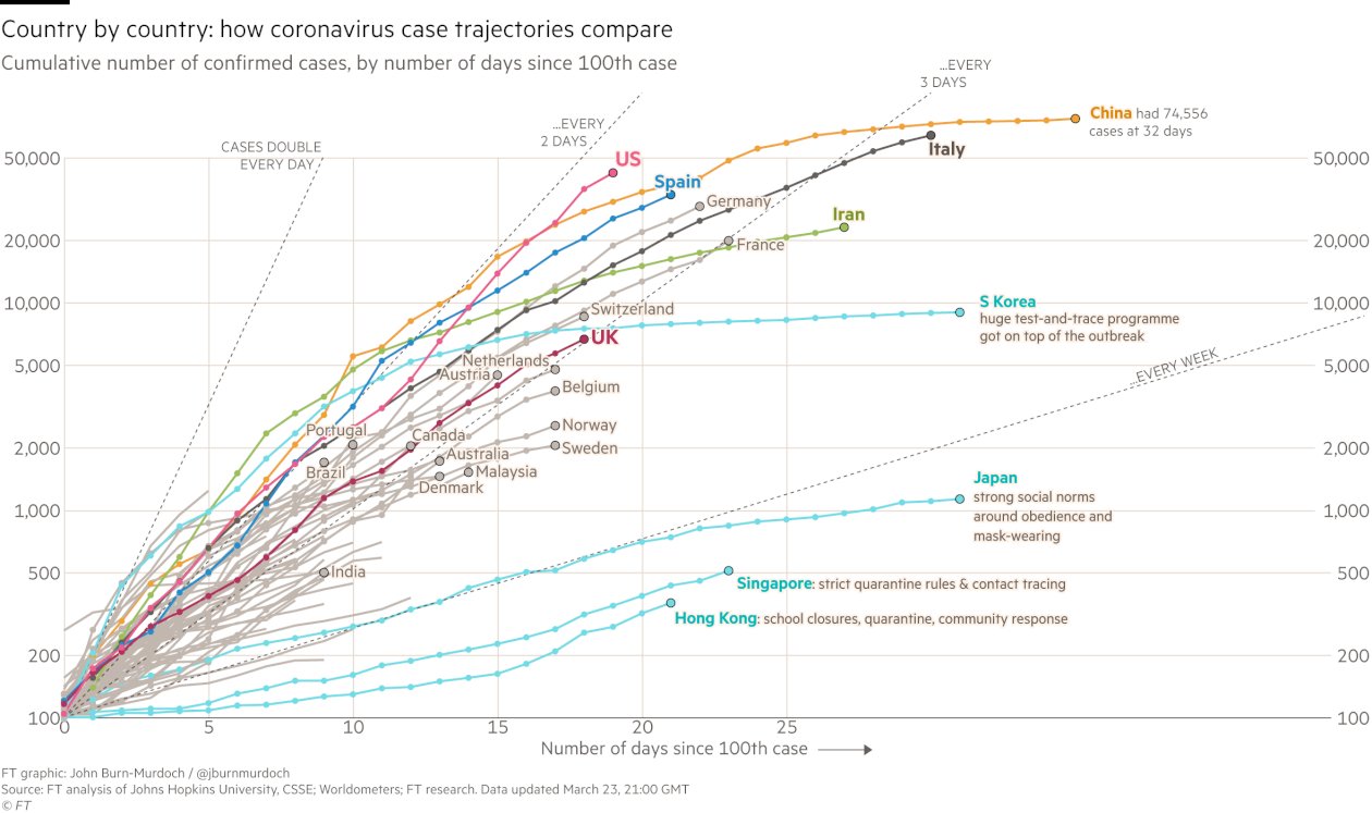
I include this sample, widely circulated these days and already outdated, just as a visual example:
These charts are frequently "cummulative" and "by date of detection/test/publication". It works like this:
- On Monday we receive 5 "positive" results.
- On Tuesday we receive 7.
- On Wednesday morning we publish a chart with a 5 followed by a 12 (5+7).
It's also very impressive, and makes us scary, saying "look at how this thing just grows and grows".
So in term of making things easy for the people redoing the chart each day, and also, maybe, of inciting awareness and action in the public, it may have some advantages.
Except, maybe not.
In comes the "epidemic curve".
It works like this:
- You politely ask the people collecting the data to collect one more piece of information: the date of first symptoms, also called the "onset date".
- Before you re-publish, you re-do the chart, with each data point representing the "positives" for each date.
- So, in the above example, you'd have Monday=5, Tuesday=7.
- People tested. Also, in a foot-note, please add which test was used.
- Number of positives. [This assumes "positivity" is a black-and-white thing. I don't know enough about laboratory procedures, but maybe there are "gray" numbers, as in "weakly positive" and "strongly positive". Anyone knows that?]
- Hospitalised, all degrees of severity.
- Severe. Defining what that means.
- In intensive care.
- Deaths.
- Recovered.
Advantages of using the epidemic curve:
You could easily have two or three data-sets on the same chart, say showing how "infections" go up and down earlier than "hospitalisations", and that "hospitalisations" happen earlier than "deaths".
That would make it easier to explain how "we're winning" even though "deaths are still going up". Because we'd see how "infections seem to have started to go down".
Some difficulties:
You have to collect and curate more data.
Sometimes you won't have the data, and will mean you won't be able to use that notification.
Of course, you will have to explain that the fact that some days numbers go down doesn't mean they will keep going down. That's called "educating your readers", and it can be done.
For data people:
All these data could be dis-aggregated by age-group, presence of risk-factors such as previous diseases or pregnancy or high body-mass-index, and all sorts of other variables.
Ideally, the chart should have a link to the raw data used in the chart, so others can aggregate.
So, what to do?
Maybe start asking those who provide us with the charts to try and take it one step further?
Maybe wait until they have some time or more resources?
Maybe look for those resources?
Maybe think of ways to facilitate the work?
In any case, thank you for reading so far. You can follow me on twitter, where I'm @lucasgonzalez, and support me on Patreon.com/fluscim. Thanks!


No comments:
Post a Comment
Note: only a member of this blog may post a comment.